Big game project – E.R.A – Eternal Resonance Arena – Post 4

This week our producer and i wrote down every single asset we have left to make and put them on the whiteboard so we easily could get a overlook. After seeing what we had left we decided to focus this week on texturing everything and we nearly reached our goal part from a few small things. Anyhow i’ve been working with finishing up our boss minion, our ranged soldier and mainly a lot of time this week has been spent on our games logo. I had something decent last week but the small “E” in E.R.A and as we looked up the famous band “ERA” we realized their logo had the small “E” aswell. The image below shows the old logo we had before i started reworking it.
Image
Lina our studentor mentor told me i should reall just go wild and try out a bunch of different styles and fonts until i find something that would be more suitable. So i just started off by making a bunch of copies of our “Shield” or “cookie” as some in the group describes it and then started experimenting. This is basically what my process looks like;

Image
First off i just started out by trying out a lot of different fonts in different colors and with different placement of the letters but i wasn’t truly satisfied with any of them until i found the look of the lower six logos. We wanted it to look like it belonged to the “cookie” but at the same time stood out enough for it to be easy to read. After some discussion within the group we decided to go with this one:

Image
It reads rather well with the background and it pops out enough to be easy to read.

Part from spending the majority of my time on the logo i came up to a texture on our boss minion that i liked a lot. I started out experimenting with neutral colors but it just came out so bland as i exported it into unity. I started playing around with a lot more colors and after some time i found something i really liked. I went with creating a focuspoint on his head with strong colors and darker, complementary tones over the rest of his body. I could spend days working on a creature like this but we just didn’t have the time for it so i had to move on.

Image

As i was working on this dude i was trying to come up with cool lines for him to say as you enter his pit, i consulted a friend who’s really good with things like this and we came up to a few variations on it:

“Gaze into my ancient eyes and embrace my unending nightmares.”

“Stare into my blackened soul and hear the terror of my nightmares.”
Image

To break up the monotone color of his shell i added a simple pattern as a final touch. These patterns are over his arms and face aswell. I wanted them to look tribal or ritualistic. Just to add some more mystique to this character.

Image
Part from this i’ve done some smaller miscellaneous tasks, creating two ground textures one grass and one muddy. I’ve textured some mushrooms modelled by my brother etc. Next week i’ll be focusing on particle effects and feedback.

Over and out, Henrik


Big game project – E.R.A – Eternal Resonance Arena – Post 3

This week has been a rather productive one, by the end of last week we realized we had to cut down some of the features we previously wanted. The programmers had been getting behind their schedual a bit and so we removed some features and Daniel our lead design / producer wrote a list of the most necessary things we had to have for GGC. These changes did not affect the graphical part a lot, some very small elements were removed but nothing major to us.

So first of all we started out with a quality time meeting with Jonatan and Lina where they took a look at what we had and gave us some pointers. One especially good idea is that we should have some kind of landmarks place in the different zones of the map. This is to give the players an easy way to communicate and update each other, for example; “Two champions are moving south of the broken log”. I looked through the Dota2 map and i couldn’t really find any landmarks like this, i’m not sure if it’s intended to be that way or if they didn’t think about it at all when they first designed the map. The more i’ve been thinking about this the more i like the idea of having a lot of these “special landmarks” that people can name themselves.

This week i had the other to graphical artists go though the different steps of our texturing guide to see if they understood and would get similiar results as me.

1.Create a highpoly (Large details!!)

2. Bake AO(Ambient occlusion)

3. Set basecolor and place the AO ontop as a multiply layer

4. Bake an object-space normal map, bring this in to photoshop and open the channels. Try turning them on and off until you find one you like with the light coming from above the model. When you find the channel that you like the best, delete the other two and bring this in to your .PSD of your diffuse and place this on the top rest. Set it to multiply at about 40%.

5. Bake a crazybump diffuse of your normal, bring it in to photoshop and remove all midtones and darker tones, only keeping the most intense highlights. When this is done, place it on top of your Point Light and AO maps with layermode colordodge at 50%. This is to give the character those extreme highlights and therefor creating more volume. Bring up Hue/saturation and check colorize, use this along with color balance in order to give the highlights a color that is somewhere close to the basecolor (except lighter ofcourse).

6. Normal layer; paint details such as markings or other information, keep in mind that too small details will probably not show and are more likely to create a messy appearance.

7. When this is done, make a copy of AO, object space normal and Diffuse, merge them in to one and set them to a complementary color as a multiply layer at 60%. When you feel satisfied with the previous steps, select all layers, make a copy of them and merge them. Set the new merged layer to overlay, go to filter>other>highpass and set the radius to 3,3 pixels and press OK.


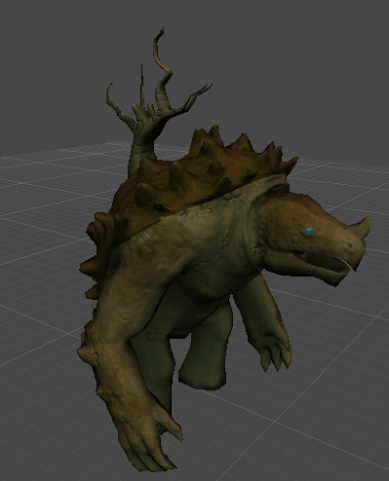
This is what it looks like at the moment but i’ll probably work more with it after GGC is done and we start working towards the real game that we intend to make later on.

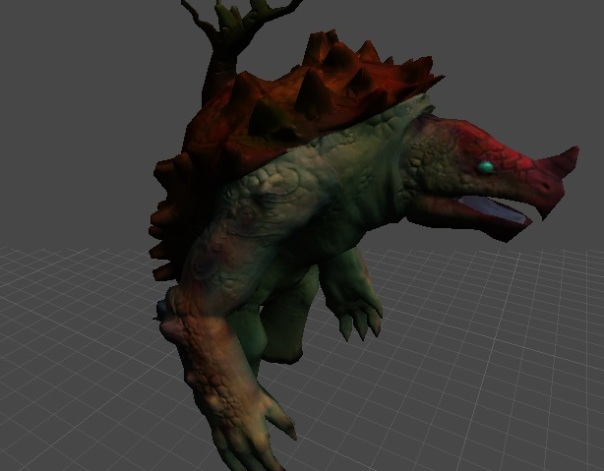
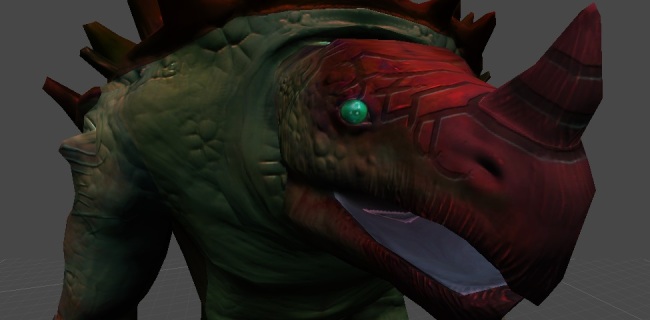
I’m getting rather used to this now and it gives me quick results after the highpoly of the model is done. Shown below is our games boss character currently called “Mr.Snappy” which obviously won’t be his final name. Right now I’m just trying to find the right colors on him, I’ve tried a wide variety of colorschemes and I think I’ll be going for something more neutral on this guy with areas of more saturated colors to create some focus on his head for example.

Image

So I’ve been working on this guy during this week as well as a logo for our game part from this I spent a day writing down every single task we have left while estimating how long time each of them would take. I did this to get a better overview on what we have to do, how long it will take and look at how much time we have left. With this we realized we might have to work some weekends and possibly work some overtime during weeks but I’m confident we’ll make it.

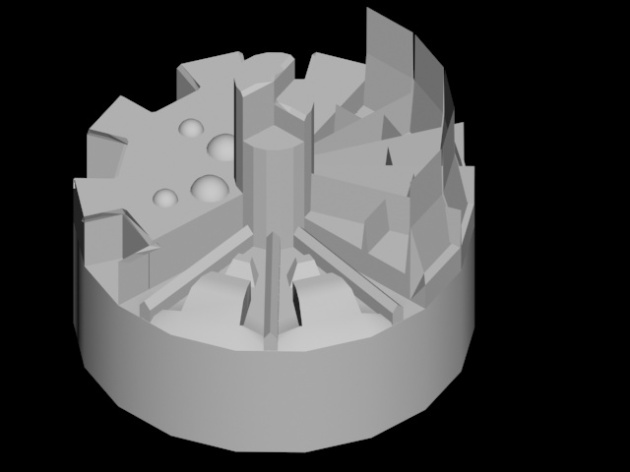
So, the first iteration of the logo as you can see below is something all of us graphical artists had part in. Amanda came up with the idea for the layout which I worked from. I started out just trying to sketch this up in photoshop but I realized that it would take a lot of time to finish it this way. I opened up 3ds max instead and created a base of how I wanted it, after that I brough it in to Mudbox and really worked out all the details of it. What I wanted to show with this is that our game will have three factions, one of them is more organic, one is more robotlike and one is rough and simple. The upper part of our logo has the biggest part since I wanted to show that humans at this day in our game is the biggest race. They have more land and inhabitants than any of the other two. This thing about three races is something we’ll implement later on however, for GGC we’ll settle with one.

Image

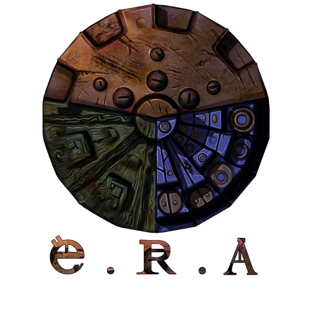
Above is the finished result and i’m quite happy with it so far but i’m going to do something more creative with incorporating the text with the actual image. As i mentioned earlier this sprung from a 3DSmax model and some work in Zbrush, this is what the 3DSmax base looked like:

Image

To sum things up we have a couple of intense weeks of work ahead of us up to GGC but as i mentioned earlier i am confident that we’ll make it, the team has been working so good this week. We had a gametesting yesterday and even though our latest version of the game didn’t work due to a spawn bug of our forest creeps people seemed to have fun and really get the idea. I talked to some about what our vision for our game is and they were really keen to see the final result. We received a lot of good feedback which we went through with the group after the alphatesting session. For example that you shouldn’t drag to walk with the mouse since it gives less precision, that you should right-click to walk instead of left-click etc. We saw a clear pattern though, people that had played MOBA’s(Multiplayer online battle arena) before was really annoyed with the left-click to walk thing while those who hadn’t played any moba didn’t bother at all. After we had gone through the feedback we had a look at the game “Blood line champions”, especially at their combat system and decided that we liked it a lot and would take a closer look at it and get inspired to create our own in a similiar way since it offers that level of intensity that we’re seeking.

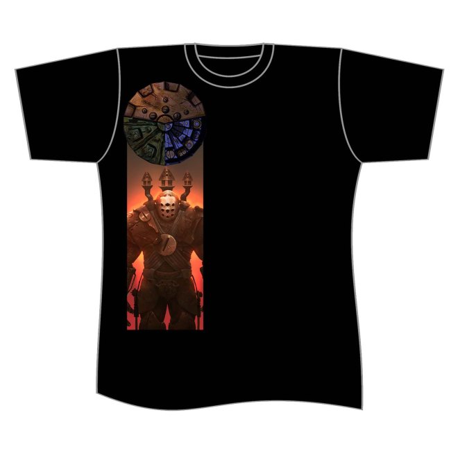
Last but not least i made a first draft of our GGC shirts and i think they’ll turn out really good with some more work.
Image

Over and out, Henrik.

Big game project – E.R.A – Eternal Resonance : Arena – Post 2

Our work on the graphical part of ERA has been running smooth, the other two has been working really swift and so we’ve gotten a lot of the content checked off our list. Almost all models for the game is done and now on we will have a lot of texturing and particle effects to create. After the quality time with the graphics teachers we came to the conclusion that i had to write a style guide for our game, something i’ve had in mind but didn’t prioritize cause i was more keen on working with the actual game. But i think they had a good point since we’ll probably continue developing this game and there for a styleguide is vital. Also all of us will probably have to work on the textures in order to get them done and because there wont be enough work. So in order to make my mental image of our game come true the other two artists will have to have some kind of framework to direct them. To set our style and way of texturing i worked with our first hero “Copperman” as a base and this is the result i came up with after many iterations.
Image
So this is what the character looks, i read and followed the dota2 texturing guide in order to reach this result with some modifications. After everything was set according to the Dota2 guide i made a copy of the AO(ambient occlusion) and point light maps, merged them and changed their color through the Hue/saturation tab to a complementary color. I also copied all of the layers, merged them and created a highpass which would be the top layer of my diffuse to make some details pop a bit more. While working with this i learnt a lot not only about texturing but how valuable it is to create basemesh with a lot of large faces to work with since you’ll have a rather zoomed out camera.

Part from texturing this badboy i’ve been creating highpoly meshes of both the helmet and his backpack which i would say is a part of the texturing process in a way.

This week i also finished up the last of our concepts; A healing platform, a home for our forest creeps in the shape of a pinecone hut(AWESOME RIGHT?!). Shown below is the concept for our forestcreeps, what will be different from the “normal” forest creeps and their chieftain is his awesome hat which i made a sketch of in the bottom corner of the image.

Image
Shown below is the healing platform, the statue i sketched up in the upper left corner of it will be placed one in each corner of the very simple platform. Lorewise these are very early sculptures of the leading god of man kind, now a days more refined sculptures of him has replaces these early rather grotesque ones. The images are balinese demon sculptures which i found really inspiring so i took a lot from them.
Image
Last but absolutely not least is the pinecone hut that the forest creeps will have as their homes spread across the map.

Image

Part from this i have been leading the other two graphical artists, they’ve asked me for opinions on their work, if they had to make any changes and so on which takes up a lot more time then i ever thought it would.

Now that we have the texturing method and almost all models done we’ll start working towards the BETA, atleast on the graphical side as we’ve already passed our alpha goals. We have a lot of work ahead of us but i don’t doubt we’ll be able to make it.

Over and out, Henrik Rosenborg

Big game project – E.R.A – Eternal resonance : Arena

Hey, so i’m supposed to write blogposts containing my thoughts, processes surrounding this years big game project. I’m a second year student at uppsala university, campus gotland in sweden. I study gamedesign and graphics, my program is in majority about game design and secondarily about graphical art for games. I came here with a heavy interested in arts and didn’t really understand what game design was to be honest. I’ve come to learn obviously what it is and come to like it but not as much as art which really is my passion. I focus mainly on 2D but i’ve had a lot of 3D courses so i do 3D modelling and all that comes with it as well.

Back to what i am doing right now, since we’re second years we didn’t really have any restrictions this year in what kind of game we were allowed to do part from passing a series of hand-ins. Our producer / lead design presented a concept to me that i just couldn’t resist joining in on. The game is called Eternal resonance : Arena and i’d classify it as a MOBA(Multiplayer online battle arena) with a twist, part from the usual 5vs5 setup and creeps that spawns automatically and runs down their lanes attacking anything that comes in their way. Instead of this being automatic we have a 6th player that works as a commander, he’s playing the RTS part and controls when and how many creeps that spawn, part from this he can perform several actions such as; building new barracks, towers and use abilites. I’ve been a roleplayer since i was twelve years old and therefor when we came to discussing lore part of E.R.A i came up with a lot of ideas. I’ve taken a large part in creating the world for our game and designing creatures, buildings and heroes. Since i was the first graphical artist to be invited to work on this concept and since i usually have a lot of ideas regarding this i naturally became the lead artist on this game.

We’re three weeks in to the course right now and so far i’ve worked on creating the majority of our concepts, i’ll post some of them later in this post. I’ve done some modelling aswell; the towers in our game and the ranged soldiers as we’d like to call them, soldiers instead of creeps or minions as that’s what they are. But as mentioned i’ve created all of the concepts except for the melee creeps in our game as well as working on the lore for a bit. I’ve just spent one whole day on the lore so far though as i felt stuck in the visual design of our game i had to settle some things regarding that. Daniel, our lead designer and i worked on this for one day and came up with a cool base for us to continue working on. I will probably post some of that later on as we come up with more. I figured i’d focus this post on the graphical part as that’s my priority right now.
Image
So this was the concept i created for our hero / champion that is simply called copperman. He’s a great hero amongst his people and is recognized by his armor completely made out of copper. We decided early on that humans in our world would be quite bulky. So i’ve been responsible of texturing this fellow something that has taken up a few days of my time before i found something i was quite happy with. I think i pressured myself to hard since 2D is my field and therefor i couldn’t come up with anything i was happy with. After a few tries and some guidance from Jonatan i finally came up with something that works. Part from creating this concept i’ve worked on a few structures, presented bellow;
Image
These were created both as concepts and blueprints for the 3D artist that would model them. The one above featuring the platform on which our commander will stand on. Both top and sideview included.

Image
The one above is a portal, in other games you would call these barracks. Since our battles are fought on floating islands far up in the sky it was more fitting to have portals that soldiers arrived through when the commanders calls for them.
Image
Featured above is a generator that will be used to harvest one of the resources the human race will need; Electricity.
Image
This helmet above was me trying out how creating a highpoly and then baking an ambient occlusion would work as a base for the diffuse. This is the helmet for our hero; copperman. This is not at all final but it will be something very close to this.
Part from working with the graphical part i have been overwatching and helping out the other graphical artists in order to get a as united style as possible.

Well this was my first post but certainly not the last for this course and since we intend to keep working on this game ever after the course is over this blog will probably be updated a lot and linked to our IndieDB page etc. So stay tuned people and follow our progress. I’m gonna make sure to have material ready for my next post, screenshots etc maybe even a few bits of lore. We’re really in to this game idea and we hope that you will as well. For more updates follow our facebookpage; https://www.facebook.com/EscapeRealityStudio

Over and out, Henrik Rosenborg